
Creative Hotlist
Bringing new life with a modern look & modern features
Overview

Creative Hotlist, a job searching site created by the famed magazine, Communication Arts, has a unique problem. The site receives ~245k monthly visitors, but only 1,150 monthly page views. There’s a total of 14K Talent Profiles, but only 55 current job listings. In this project my team and I conducted research and redesign work in order to solve this problem and bring new life to the site.
Project Scope
Timeline: ~2 Weeks
# of Teammates: 3
Tools: Sketch, Adobe Illustrator, InVision, Craft CMS
My Roles: Lead Visual Designer, Interaction Designer, & Project Manager
Who is Creative Hotlist?

Creative hotlist is a subsidiary company to Communication Arts.
Communication Arts, founded in 1959, is one of the largest creative magazines in the world and was the first major publications to launch a web presence in 1995. Part of the initial launch was a career section that included listings of jobs available and wanted ads. This section quickly became a premiere career resource for the professional creative marketplace and was relaunched as Creative Hotlist in 2001, a dedicated career resource for creative professionals.
Design Brief
They are a veteran player in this space, but had not updated their site or kept up with the times. Their website was almost unusable on mobile. The lack of modernization rendered them irrelevant to their target audience.
Our stakeholders knew they needed to modernize but were overwhelmed with the possibilities. They needed guidance on what features to prioritize and help implementing them. My team and I took on the initiative to bring the site back to life with a fresh look and new features that was backed by data gathered from research.
Following our kick-off meeting with our stakeholders, my teammates and I set goals for what we wanted to uncover in our research.
We began our research process by conducting user interviews which focused around 3 main questions:
User Interviews

After completing rounds of interviews, we built an affinity map to synthesize the data…
Research Insights
Based on our research, we discovered three prominent insights:
People like to browse and save jobs on their mobile devices and then apply for them using a desktop.
2. Users would feel a sense of burden when an application would take longer than 15 minutes to submit.
3. They also feared that their application wouldn’t stand out enough and wished there could be some sort of feedback for them to know if the position was filled or if their application was even looked at.
We also asked our interviewees what sites they were using in order to conduct their job search, and found that most users were using one or more of these three websites - LinkedIn, Indeed, and Glassdoor. We conducted a competitive analysis to see what these sites were doing right.
Competitive Analysis
As you can see from the graphic, Creative Hotlist was missing some key features.
With no native app or responsive design, users can only use the site on a desktop, but our users at least want the ability to browse for jobs online.
Showing company reviews allows users to learn more about a company and what it’s like to work there. Having some sort of ‘Quick Apply’ option allows users to apply for jobs in a faster, more efficient way, which helps keep them motivated during their job hunt.
Interestingly, Creative Hotlist and LinkedIn were the only ones to have ‘premium’ features for monetization. But the one Creative Hotlist had didn’t seem to be as useful. We’ll revisit the concept of “premium” features later on in this case study.
Lastly, Creative Hotlist does not suggest or recommend jobs to users based on their preferences or search history. Having a site that recommends jobs that a user might want to apply for is a huge time saver and builds trust that the site as a service is effective.
Journey Map
In order to get a better understanding of our users’ attitudes while using the current version of the site, we built a Customer Journey Map.
At a basic level the site has good components. It’s just not meeting the needs of users in modern times.
A user can create and set up a profile easily, but cannot use the site on mobile. It’s easy to find and view a job, but there’s a very limited number posted on the site. When it comes to applying for a job, our users have to be redirected to the employer site and apply through there. This process takes a long time and has to be repeated each time they want to apply for a job.
Then comes the follow-up. Users get notified when their application is being reviewed or if they are moving into the next phase of the interview process and that makes them feel positive. It’s when they don’t ever hear anything back that makes them feel negative - Did their application get through to someone? Did the position get filled?
We want to help our users feel like their applications aren’t just going off into a black hole, but instead following a process that will end in them getting an answer (yes/no).
Heuristic Evaluation
In this section I posted a series of annotated images that observe and break down individual components of the (then) current state of Creative Hotlist in order to identify opportunities for growth and improvement.
Feel free to click on an image to have it expand into full screen view.
Problem Statement
It was at this point that my team and I felt like we had gathered enough insights from our research to begin the design phase. Keeping our insights in mind, we created this problem statement:

This brought us to our Hypothesis Statement:
Hypothesis

We created our persona, Jenna, to help summarize our goals for our design and to act as our North Star throughout our design process.
Let’s get to know her:
Persona

Keeping our insights and persona in mind, my teammates and I defined clear and concise design goals to guide us through our design process:
Design Goals

Iterations - Portfolio Page

Our main goal with the Portfolio portion of our Talent profile was to make it very customizable. It was important that our users can upload multiple forms of media (image, video, gif), in various sizes and dimensions, that way each user's Portfolio was unique.
Here we have a low fidelity digital wireframe where we’re using it to help define our spacings and margins.


Here we have the upload screen that tells the user what kinds of media are supported on this page as well as how to upload their content to our site.
This final image is what a somewhat “finished” Portfolio could look like on our site. We want the user to be able to drag and readjust the content to their liking giving them lots of flexibility and freedom.

Mobile Prototype


Other Case Studies

Provider Finder
UX Research & Design / Mobile Web App
Conducted freelance design and research work for Embold Health for their customer facing product focused on helping users find the right kind of healthcare, utilizing rigorous analysis of millions of medical cases. The design is to be used initially with a Fortune 100 company and its 2.1 million employees but will eventually be a tool open to the public.
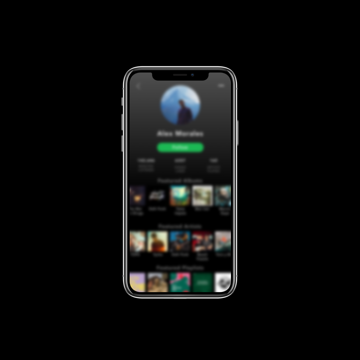
Spotify
Feature Implementation Concept / Native App
Conceptual rethinking of the Profile Page & how adding customization can increase engagement amongst Spotify’s most loyal listeners.